The On Mobile settings allow you to choose how your widget appears to visitors using smartphones and tablets. You can either mirror your desktop layout or select a mobile-optimised format that suits smaller screens better.
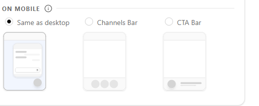
Choosing Your Mobile Layout
Select one of three display options:
Same as Desktop — The widget displays exactly as it does on desktop. Best if your desktop layout already works well on mobile.
Channels Bar — Displays a compact horizontal bar at the bottom of the screen showing your available contact channels. Ideal for keeping the widget visible without taking up too much screen space.
CTA Bar — Shows a slim call-to-action bar at the bottom of the screen with a custom title and button. Best for driving a specific action like “Chat with us now!”
Channels Bar Settings
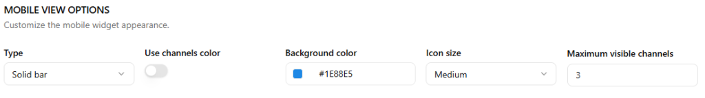
Once Channels Bar is selected, the following options become available:
- Type — Choose between Solid bar or other styles
- Use channels color — Toggle on to automatically use each channel’s brand color
- Background color — Set a custom background color for the bar
- Icon size — Choose Small, Medium, or Large
- Maximum visible channels — Set how many channels show at once (default: 3)
CTA Bar Settings
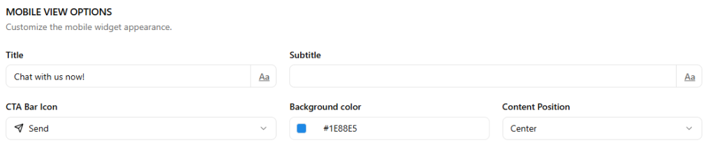
Once CTA Bar is selected, the following options become available:
- Title — The main text displayed on the bar e.g. “Chat with us now!”
- Subtitle — Optional supporting text below the title
- CTA Bar Icon — Choose an icon to display alongside the text
- Background color — Set a custom background color
- Content Position — Align content to Left, Center, or Right