This section controls how your chat widget looks and behaves on desktop screens.
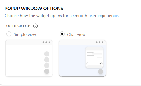
Choose Your Widget Style #
Select how you want the widget to appear to visitors on desktop.
- Simple view — Shows a small floating bubbles button on the page. Clean and minimal. Best if you just want a quick contact trigger without taking up screen space.
- Chat view — Opens an expanded chat panel with a header and welcome message. Best if you want to greet visitors and give them more context before they reach out.
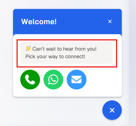
Welcome Messages (Chat view only) #
If you selected Chat view, two additional fields will appear for you to personalise the experience.
- Chat view header message — The title displayed at the top of the chat panel. Keep it short and welcoming, for example: “Welcome!” or “Hi there!”
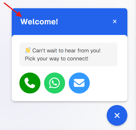
- Chat view welcome message — A short line of text shown inside the chat panel to prompt visitors to take action, for example: “👋 Can’t wait to hear from you! Pick your way to connect!”
Widget Icon Appearance #
Use these fields to style the widget button so it matches your brand.
Icon shadow — Add a drop shadow behind the button to make it stand out. Options are None, Small, Medium, or Large.
Icon type — Choose the icon that appears on the button, such as a send, phone mail e.t.c
Icon position — Set whether the widget floats on the left or right side of the screen.
Icon background — Pick the background colour of the button using a hex colour code (e.g. #2363EB).
Icon size — Control how big the button appears. Options are Small, Medium, or Large.
Icon color — Set the colour of the icon itself. White (#FFFFFF) works well on dark-coloured backgrounds.
Border color — Choose a colour for the outline around the button.
Border width — Set the thickness of the border in pixels. Enter 0 if you don’t want a border.