The Visual Customization step allows you to control how the widget looks and behaves on your website. You can customize the widget layout, icon style, greeting message, and attention effects to match your brand.
Popup Window Options #
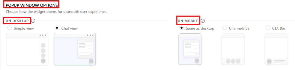
The Popup Window Options section controls how the SiteLeads widget opens when visitors interact with it. These settings allow you to define different display behaviors for desktop and mobile users to ensure a smooth experience across devices.
Desktop View Options #
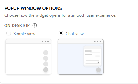
Under On Desktop, you can choose how the widget content appears when opened.
Simple view
Displays the widget as a compact panel showing the available communication channels. This is ideal when you want visitors to quickly select a contact method.
Chat view
Displays the widget in a chat-style interface. This layout is useful when using conversational interactions or when combining channels with messaging-style engagement.
Mobile View Options #
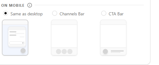
Under On Mobile, you can define how the widget behaves on smaller screens.
Same as desktop
Uses the same layout selected for desktop devices.
Channels Bar
Displays the channels in a horizontal bar optimized for mobile interaction.
CTA Bar
Displays a call-to-action bar that encourages visitors to open the widget.
These mobile-specific options ensure the widget remains accessible and easy to use without taking up too much screen space.
Desktop View Options #
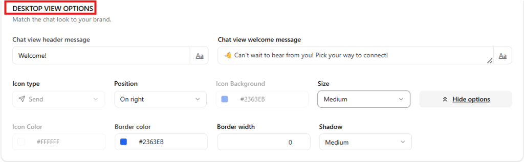
The Desktop View Options section allows you to customize how the chat interface appears to visitors on desktop devices. These settings help you match the chat experience with your website’s tone and branding.
Chat View Header Message #
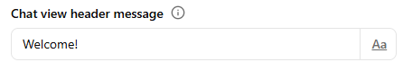
The Chat View Header Message controls the short title displayed at the top of the chat window.
Purpose
- Acts as the main heading of the chat interface.
- Helps greet visitors or indicate the purpose of the chat.
Example: Welcome!
Tips
- Keep the message short and friendly.
- Use it as a greeting or brand introduction.
Example alternatives
- “Welcome to Support”
- “Chat With Us”
- “We’re Here to Help”
Chat View Welcome Message #
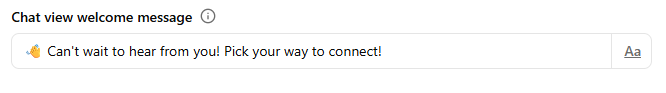
The Chat View Welcome Message is the first message visitors see when they open the chat window.
Purpose
- Encourages visitors to start a conversation.
- Explains how they can get help or contact your team.
Example: 👋 Can’t wait to hear from you! Pick your way to connect!
Tips
- Use a friendly tone.
- Keep it clear and inviting.
- You may include emojis to make it more welcoming.
Example alternatives
“Need help? Choose an option below to get started.”
“Hi there! How can we help you today?”
“Welcome! Send us a message and we’ll get back to you shortly.”
Icon type #
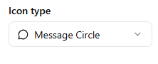
This setting controls the icon used to open the widget.
Available options include:
- Send
- Message Circle
- Message Square
- Phone
- Smartphone
- Upload custom icon
Choosing the right icon helps visitors immediately understand how to interact with the widget.
Position #
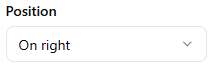
Determines where the widget launcher appears on the screen.
Options:
- Left
- Right
Most websites place the widget on the right side for consistency with common chat interfaces.
Icon Background #
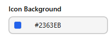
Sets the background color of the widget launcher.
Example: #2363EB
Choose a color that matches your brand palette.
Size #
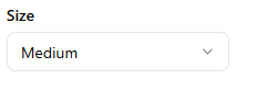
Controls the size of the widget launcher icon.
Options typically include:
- Small
- Medium
- Large
Medium is recommended for most layouts.
Additional styling options #
Click More options to access advanced styling controls.

These include:
Icon Color
Sets the icon color inside the launcher.
Shadow
Adds a shadow effect to make the widget stand out.
Border width
Controls the thickness of the launcher border.
Border color
Sets the border color when a border is applied.
Greeting #
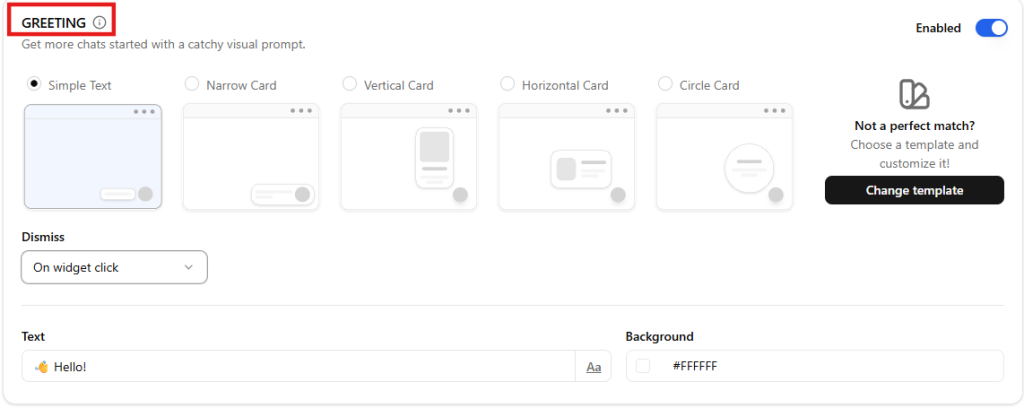
The Greeting feature allows you to display a short message next to the widget to encourage visitors to start a conversation. This visual prompt helps increase engagement by drawing attention to the widget.
You can enable or disable this feature using the Enable Greeting toggle.
Greeting styles #
You can choose how the greeting appears by selecting one of the available layouts:
Simple Text
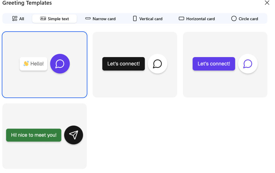
Narrow Card
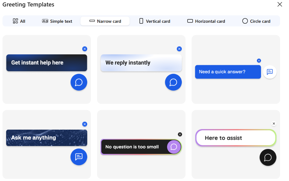
Vertical Card
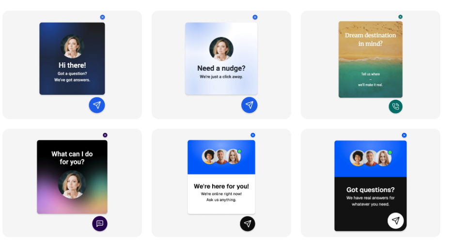
Horizontal Card
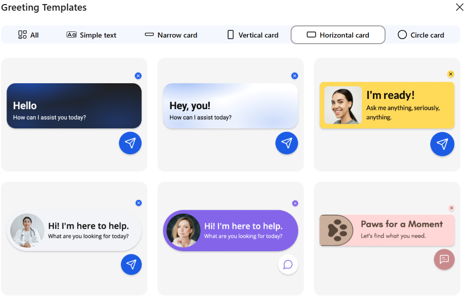
Circle Card
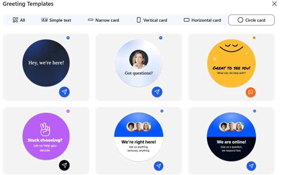
Each style changes how the greeting message is displayed alongside the widget.
Greeting message #
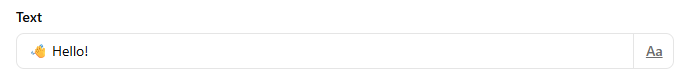
The Text field allows you to customize the greeting message shown to visitors.
Example: Hello! world
This message should be short, friendly, and inviting.
Background #
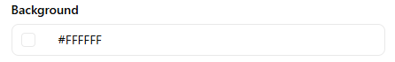
You can customize the greeting background color to match your site’s design.
Dismiss behavior #
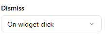
The Dismiss setting controls how the greeting disappears after being shown.
Options include:
On widget click
The greeting disappears when the visitor clicks the widget.
Disappear after X seconds
The greeting automatically hides after a set period of time.
Attention Effects #
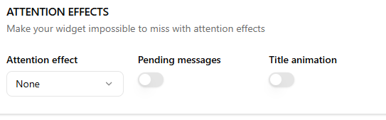
Attention effects help draw visitors’ attention to the widget.
The Attention Effects section helps make your widget more noticeable to visitors by adding subtle visual cues and notifications. These settings are designed to increase engagement without interrupting the browsing experience.
This setting allows you to apply an animation to the widget launcher to draw attention to it.
Available effects include:
- None
- Shockwave
- Waggle
- Shine
- Bounce
- Blink
- Pulse
- Spin
You can select the effect that best matches your site’s style. For most websites, subtle effects like Pulse or Shine work well.
Pending messages #
When enabled, the widget shows a notification indicator when there are unread or pending messages. This helps visitors notice that a response is available.
Title Animation #
The Title Animation feature helps notify visitors when a new message is received in the chat. When enabled, the browser tab title will automatically change to attract the user’s attention, especially if they have switched to another tab.
This feature is useful for ensuring visitors do not miss responses from your support team.
Enable / Disable Title Animation #
The Title Animation toggle allows you to turn this notification feature on or off.
- Enabled – The browser tab title will change when a new chat message arrives.
- Disabled – The browser tab title will remain unchanged.
Enabling this option helps bring users back to the chat if they are browsing another tab.
Page Title #
The Page Title field lets you define the text that will appear in the browser tab when a new message is received.
Example
📩 You have a new message!
When a message arrives, the browser tab title will temporarily change to this text to alert the visitor.
Best Practices #
- Keep the message short and attention-grabbing.
- Use simple wording so users instantly understand the notification.
- Adding an emoji (like 📩 or 💬) can make the notification more noticeable.
Example alternatives
🔔 New chat notification
💬 New message from support
📩 You received a reply